Take a look
Browse a collection of my graphic design work and get a feel for the ideas, visuals, and details behind it.
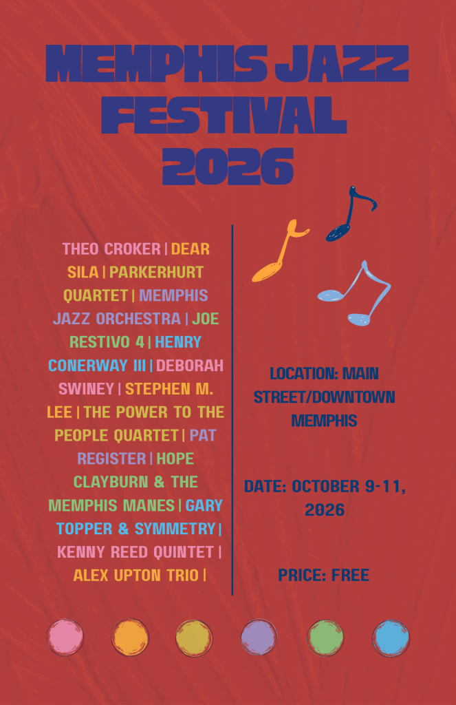
For this Flyer project, I chose the 2026 Memphis Jazz Festival. I tried to target younger audiences by blending modern styles with classic influences. Inspired by Memphis cubist artist George Hunt’s 2019 Beale Street Music Festival painting, I paired its vibrant colors and chaotic asymmetry with the original event’s clean typography and textured background. To balance visual excitement and readability, I maintained a structured layout hierarchy. I used bold capitalized lettering, larger font sizes for the main title, and different colors for artist names to draw attention without letting the information become lost in the artwork.
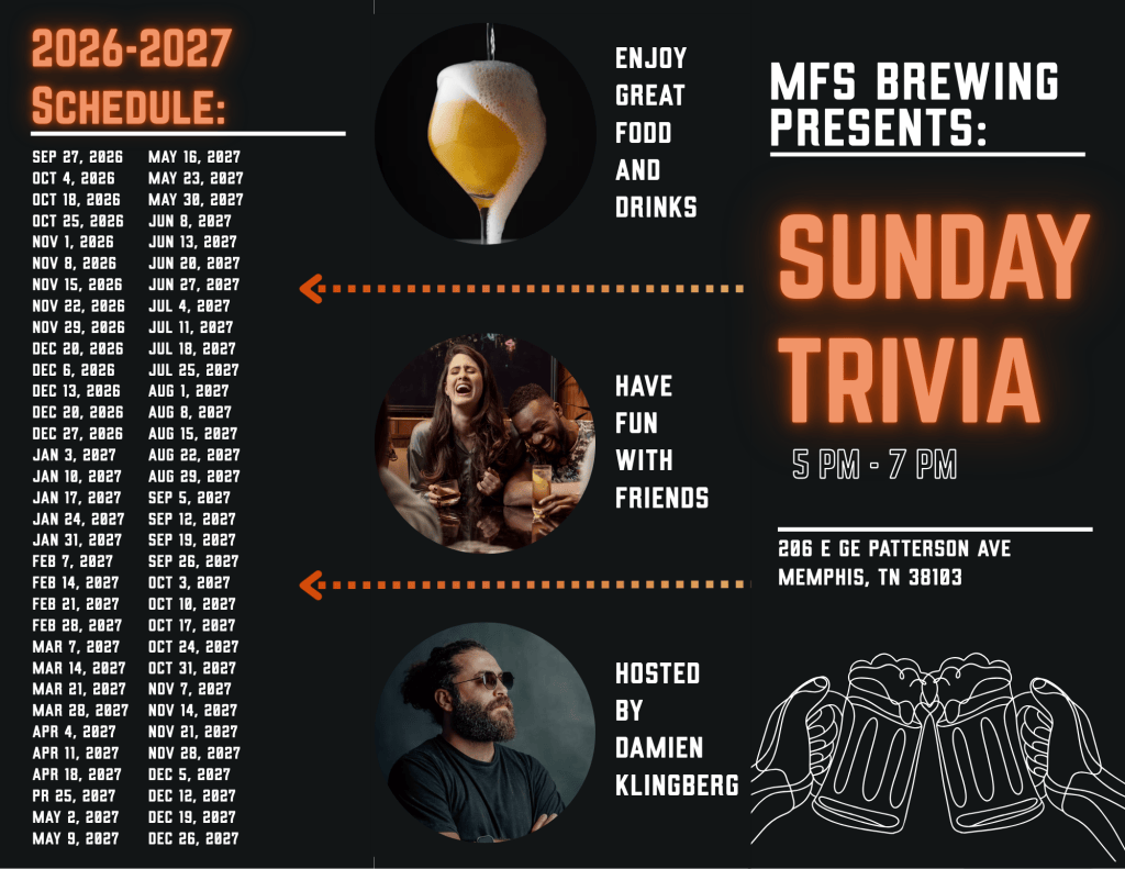
For the Brochure project, I chose the Sunday Trivia at MFS Brewing event. I began to research the event, which led me to the company’s Facebook page and website. The fonts chosen are inspired by their Facebook posts marketing their events and the overall vibe that the company had on their website. I wanted to keep it less girly and more manly and playful. The brand seems to be manly, but I wanted to keep it playful because it was about their trivia night. The colors I chose were based on the company’s logo and website. I added the arrows to draw people’s attention to the schedule while connecting the middle and ending sections of the Z-fold.
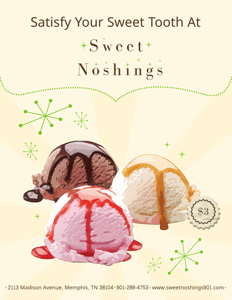
For the Advertisement Project I chose Sweet Noshing’s. The colors I used came from the logo and the font as well. I chose to do a retro look because the logo seemed fun and retro. I added stars inspired by the logo and used them to separate information at the bottom as well as added them around the ice cream graphic. I also created a midcentury modern shape to add to the graphic as well. The line that separates the title from the graphic is inspired by the border around the logo, and the light pattern I added to the back was used to continue the retro look. I also created the price sticker to highlight the price information and add to the graphic.
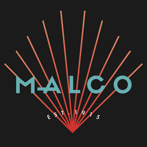
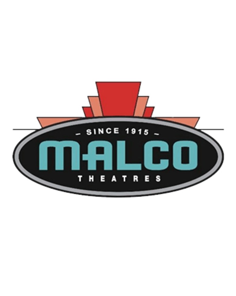
This is the Logo Redesign project. I chose to update the Malco Logo. I kept the art deco style while maintaining the brand colors and polished the graphics to make it modern.

